When we launched Advan 5 years ago, we were really excited at the prospect of developing a new type of dataset. One that would give investors an alternative view into the companies and markets that they care about.
We are data geeks at heart and we spent years agonizing over how to make our data more precise; manually drawing geofences around millions of locations, for thousands of companies. Normalizing data became almost an obsession. We wanted to remove any possible bias - from the way data had been collected to how it was mapped. By eliminating noise from the data, and backtesting it against multiple sources we made sure traders and investors could rely on it for critical decisions.
With the markets steady and rising, investors looking for an edge found that this new technology could provide one. But while we and our clients continuously model potential risks to specific investments and broad portfolios, few of us anticipated the extent of the situation we now find ourselves in.
Now, markets are trying to make sense of the unpredictable. While governments and authorities are balancing decisions that literally mean life or death for many, balanced against a potentially catastrophic effect on our economies.
Over the past several weeks, as the crisis due to the COVID-19 pandemic has evolved, it has become clear that geolocation data can play a key role by also providing an alternative view into the world we live in. And that our focus on tracking foot traffic - with an accuracy of 10 meters - could serve a broader public good.
By pinpointing the number of people at any location across the country, within hours, it is possible to understand how and where people are moving at any given time. Retailers can track which location their customers are visiting, and where they have travelled from. They can easily compare data for different US States, and even in other countries. For investors, location data provides the most accurate source of information about likely company performance.
Perhaps most importantly, for governments and authorities, location data can help with decision-making that supports both businesses and individuals in their communities.
To help make it easier to understand the changing landscape, we developed an interactive map of global hotspots, that instantly shows where groups of more than 50 people are gathering, for more than 15 minutes at a time. This offers an informative and accurate picture of movement around the world, on an almost real-time basis. In addition, we've partnered with Knoema, which aggregated visualizations from multiple alternative data sources to its website to help policy-makers, media outlets and the public track the spread of COVID-19 and measure its impact.
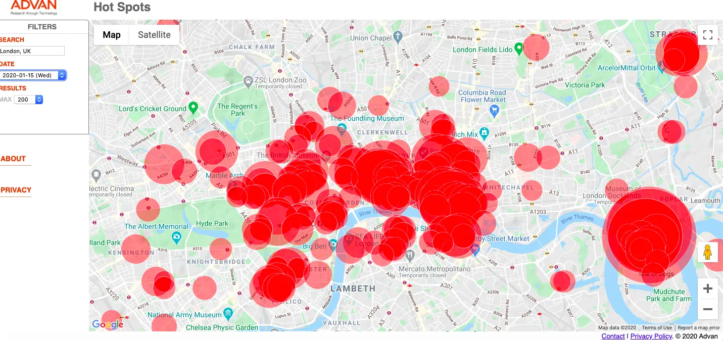
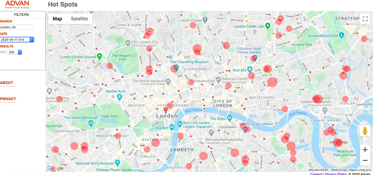
The examples below show how foot traffic changed in central London, UK between mid-January and mid-April.
Each map shows the 200 busiest locations on the respective dates. The size of the red spots is proportionate to the total number of people seen at each location and excludes residents.
In January, you can see many large hotspots, with particular concentrations in the City and Canary Wharf as well as in West London - places where people work and shop.
London - January 15, 2020

In April, you can see the stark difference, once the majority of people are working from home. With hotspots primarily around hospitals and other essential businesses.

As businesses and workplaces gradually reopen, we will be able to easily see how behavior is shifting and the extent to which people are adhering to mandates that limit social interaction. We also hope that it will aid a swift recovery - with fast and accurate data at its core.
To view our Hotspot map, please visit: https://advanresearch.com/hotspots/

